Showing posts with label iPad. Show all posts

Wednesday, March 28, 2012

Big Data, R and HANA: Analyze 200 Million Data Points and Later Visualize Using Google Maps

Technologies: SAP HANA, R, HTML5, D3, Google Maps, JQuery and JSON

For this fun exercise, I analyzed more than 200 million data points using SAP HANA and R and then brought in the aggregated results in HTML5 using D3, JSON and Google Maps APIs.  The 2008 airlines data is from the data expo and I have been using this entire data set (123 million rows and 29 columns) for quite sometime. See my other blogs

The results look beautiful:


Each airport icon is clickable and when clicked displays an info-window describing the key stats for the selected airport:


I then used D3 to display the aggregated result set in the modal window (light box):


Unfortunately, I can't provide the live example due to the restrictions put in by Google Maps APIs and I am approaching my free API limits.

Fun fact:  The Atlanta airport was the largest airport in 2008 on many dimensions: Total Flights Departed, Total Miles Flew, Total Destinations.  It also experienced lower average departure delay in 2008 than Chicago O'Hare. I always thought Chicago O'Hare is the largest US airport.

As always, I just needed 6 lines of R code including two lines of code to write data in JSON and CSV files:

################################################################################
airports.2008.hp.summary <- airports.2008.hp[major.airports,     
    list(AvgDepDelay=round(mean(DepDelay, na.rm=TRUE), digits=2),
    TotalMiles=prettyNum(sum(Distance, na.rm=TRUE), big.mark=","),
    TotalFlights=length(Month),
    TotalDestinations=length(unique(Dest)),
    URL=paste("http://www.fly", Origin, ".com",sep="")), 
                    by=list(Origin)][order(-TotalFlights)]
setkey(airports.2008.hp.summary, Origin)
#merge the two data tables
airports.2008.hp.summary <- major.airports[airports.2008.hp.summary, 
                                                     list(Airport=airport, 
                                                          AvgDepDelay, TotalMiles, TotalFlights, TotalDestinations, 
                                                          Address=paste(airport, city, state, sep=", "), 
                                                          Lat=lat, Lng=long, URL)][order(-TotalFlights)]


airports.2008.hp.summary.json <- getRowWiseJson(airports.2008.hp.summary)
writeLines(airports.2008.hp.summary.json, "airports.2008.hp.summary.json")                 
write.csv(airports.2008.hp.summary, "airports.2008.hp.summary.csv", row.names=FALSE)
##############################################################################

Happy Coding and remember the possibilities are endless!

Thursday, March 22, 2012

Tracking SFO Airport's Performance Using R, HANA and D3

Visualize Big Data Using R, HANA, D3, JSON and HTML5/JavaScript

This is my first introduction to D3 and I am simply blown away.  Mike Bostock (@mbostock), you are genius and thanks for creating D3!  With HANA, R, D3, HTML5 and iPad, and you got yourself a KILLER combo!

I have been burning my midnight oil on piecing together my big data story using HANA, R, JSON and HTML5.  If you recall, I did a technical session on R and SAP HANA at DKOM, SAP's Development Kickoff Event last week where I showcased the supreme powers of R and HANA when analyzing 124 million records in real time.  R and SAP HANA: A Highly Potent Combo for Real Time Analytics on Big Data

Since last week, I have been looking for other creative ways to analyze and then visualize this airlines data. I am very fortunate to come across D3.  After spending couple of hours with D3, I decided to build the calendar view for the airlines data I have.  The calendar view is the first example Mike shows on his D3 page. Amazingly awesome!

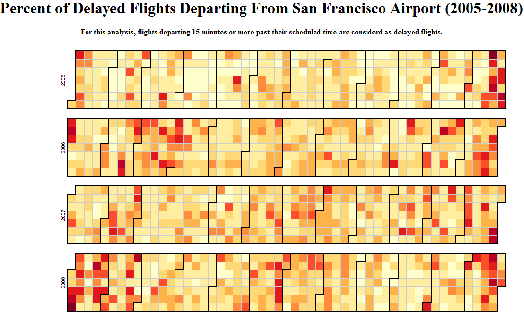
I created this calendar view capturing the percent of delayed flight from SFO airports that departed daily between 2005-2008.  For this analysis, I used HANA to get the data out for SFO (out of 250 plus airports) over this 4 years period in seconds and then did all the aggregation in R including creating a JSON and .CSV file in seconds again.  Later, I moved to HTML5 and D3 to generate this beautiful calendar view showing SFO's performance.  Graphics is presented below:


As expected, December and January are two notorious months for flights delay.  Have fun with the live example hosted in the Amazon cloud..

Once again, my R code is very simple:


## Depature Delay for SF Airport
ba.hp.sfo <- ba.hp[Origin=="SFO",]


ba.hp.sfo.daily.flights <- ba.hp.sfo[,list(DailyFlights=length(DepDelay)), by=list(Year, Month, DayofMonth)][order(Year,Month,DayofMonth)]
ba.hp.sfo.daily.flights.delayed <- ba.hp.sfo[DepDelay>15,list(DelayedDailyFlights=length(DepDelay)), by=list(Year, Month, DayofMonth)][order(Year,Month,DayofMonth)]
setkey(ba.hp.sfo.daily.flights.delayed, Year, Month, DayofMonth)
response <- ba.hp.sfo.daily.flights.delayed[ba.hp.sfo.daily.flights]
response <- response[,list(Date=as.Date(paste(Year, Month, DayofMonth, sep="-"),"%Y-%m-%d"), 
                           #DailyFlights,DelayedDailyFlights,
                           PercentDelayedFlights=round((DelayedDailyFlights/DailyFlights), digits=2))]
objs <- apply(response, 1, toJSON)
res <- paste('{"dailyFlightStats": [', paste(objs, collapse=', '), ']}')
writeLines(res, "dailyFlightStatsForSFO.json")                 
write.csv(response, "dailyFlightStatsForSFO.csv", row.names=FALSE)


For D3 and HTML code, please take a look at this example from D3 website. 

Happy Analyzing and Keep That Mid Night Oil Burning!